
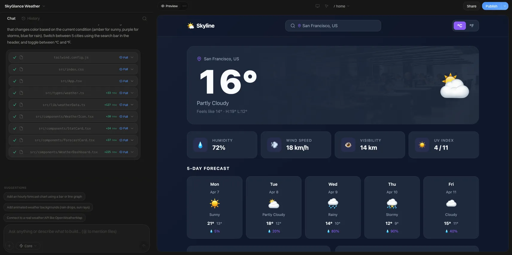
Black Color for Website: Palettes, Hex Codes, Contrast
Pick the right black color for a website: hex palettes with measured contrast ratios, readability rules, and when a dark background works.
Short answer: For most websites, use a near-black like #0A0A0A, #121212, or #1A1A1A as the background instead of pure #000000, pair it with off-white text (#E5E5E5) and a muted gray (#A3A3A3) for secondary text, and add one bright accent. Every text pair should reach at least 4.5:1 contrast. Pure black is best saved for image-heavy or dramatic pages.
Which black should you actually use?
"Black" on the web is a range, not a single color. The differences are small on paper and obvious on screen.
| Name | Hex | Best for |
|---|---|---|
| Pure black | #000000 | Photography, video, luxury or editorial hero sections, OLED-friendly layouts |
| Rich black | #0A0A0A | Marketing sites that want near-black depth with a hint of softness |
| Charcoal | #121212 | Content sites, SaaS pages, blogs with long reading sessions |
| Soft charcoal | #1A1A1A | Cards, panels, and raised sections on top of a darker base |
A simple rule: the more text a page carries, the less black the background should be. Pure black with pure white text produces the maximum possible contrast (21:1), and on long paragraphs that glare can tire the eye. Dropping to a near-black background and an off-white text color keeps contrast very high without the halo effect some readers notice.
A tested dark palette with hex values
The ratios below were calculated with the WCAG relative-luminance formula, so you can reuse them with confidence.
| Role | Hex | Contrast on #0A0A0A |
|---|---|---|
| Page background | #0A0A0A | n/a |
| Primary text | #E5E5E5 | 15.72:1 |
| Headings (max emphasis) | #FFFFFF | 19.8:1 |
| Secondary text | #A3A3A3 | 7.85:1 |
| Accent / links | #4F9CF9 | 7.03:1 |
| Warning / highlight | #F5B942 | 11.22:1 |
| Success | #34D399 | 10.3:1 |
| Error | #F87171 | 7.16:1 |
Add a surface color for cards and sections: #1A1A1A on a #0A0A0A page. Surfaces should step lighter as they rise, because shadows are nearly invisible on black. Primary text on #1A1A1A still measures 13.82:1.
Colors that fail on black
These are common choices that look reasonable until you measure them:
- #737373 gray text on #0A0A0A is 4.18:1, below the 4.5:1 minimum for body text. On #121212 it drops to 3.95:1.
- #2F6FDB blue links on #0A0A0A are 4.16:1. A blue that reads well on white often needs to be lightened for dark mode.
- #6B7280 gray on #121212 is 3.88:1.
If you need a quiet tone for captions, #A3A3A3 is a safer floor on every background in the table above.
Contrast table: common pairs on dark backgrounds
| Text color | on #000000 | on #121212 | on #1A1A1A |
|---|---|---|---|
| #FFFFFF | 21.0 | 18.73 | 17.4 |
| #E5E5E5 | 16.67 | 14.87 | 13.82 |
| #A3A3A3 | 8.33 | 7.43 | 6.9 |
| #4F9CF9 | 7.46 | 6.65 | 6.18 |
| #F5B942 | 11.9 | 10.62 | 9.86 |
| #34D399 | 10.92 | 9.74 | 9.05 |
| #F87171 | 7.59 | 6.77 | 6.29 |
| #737373 | 4.43 | 3.95 | 3.67 |
The WCAG thresholds are 4.5:1 for normal text, 3:1 for large text, and 3:1 for meaningful non-text elements such as input borders and icons. Anything below those numbers should be darkened or lightened until it passes.
Readability rules for dark backgrounds
- Never use pure white for long body text. Reserve #FFFFFF for headings and key numbers; use #E5E5E5 or similar for paragraphs.
- Increase line height slightly. Light text on dark can look tighter than dark text on light. A body line height of around 1.6 gives lines room.
- Avoid thin font weights on dark. Light-weight type at small sizes loses stroke definition on a dark background. Use regular weight or heavier for body copy.
- Do not rely on shadows for depth. Use lighter surface steps (#0A0A0A, #121212, #1A1A1A) and subtle borders instead.
- Desaturate or lighten big color areas. Large blocks of fully saturated color vibrate against black. Keep saturated colors for buttons and small accents.
- Test text over images. If copy sits on a photo, add a dark overlay or gradient behind it and measure the worst-case spot, not the average one.
- Keep focus states visible. A focus ring needs 3:1 against the background; a bright accent color usually does the job.
When a black website works (and when it does not)
Dark backgrounds suit some content far better than others.
| Works well | Think twice |
|---|---|
| Photography and film portfolios | Long-form articles and documentation |
| Music, gaming, and entertainment | Dense data tables and forms |
| Premium products and luxury brands | Healthcare or government pages with older audiences |
| Developer tools and dashboards | Print-heavy pages people will physically print |
| Event and launch pages | Pages with many third-party embeds designed for white |
If you are unsure, consider supporting both themes. Browsers expose a prefers-color-scheme media query so your CSS can follow each visitor's system setting, but every color pair then needs to pass contrast in both themes.
How to build a black color scheme step by step
- Choose the base. Start with #0A0A0A or #121212 unless the site is mostly imagery.
- Set two text colors. One off-white for reading (#E5E5E5), one muted gray (#A3A3A3) for captions.
- Define two surfaces. A page background and a lighter card color (#1A1A1A).
- Pick one accent. Choose a bright color and measure it against the base and the card color.
- Define states. Success, warning, and error colors should each reach 4.5:1 when used as text.
- Check every pair. Run each text and background combination through a WCAG contrast checker.
- Look at it on a real phone. Check the page in a dim room and in daylight; glare changes how dark designs read.
Black and white, black and gold, black and color
- Black and white: The most stable pairing. Use white for headings and gray tones for everything else so the page does not feel like a stark poster.
- Black and gold or amber: A classic premium look. #F5B942 passes comfortably on every dark background above, but keep it to accents and buttons.
- Black and a cool accent: Blues and mints read as technical and modern, which is why they show up so often in software marketing.
For ready-made examples, browse the dark-led starting points Black Ivy and Black Lantern. Dark layouts also leave footers easy to overlook, so see website footer design examples for ways to keep link text legible at the bottom of a black page.
Putting it into practice
Building a site on We.Inc is free for every account, with no card needed. The AI builder that drafts a site from a prompt starts on the Starter plan at $20 a month. You can sign up here.
Whatever tool you use, the process is the same: pick the base, set the text colors, measure every pair, and adjust until the numbers pass.
Frequently asked questions
What is the best black hex code for a website background?
There is no single best value, but a near-black such as #0A0A0A, #121212, or #1A1A1A is usually easier to read for long text than pure #000000. Pure black works well for photography-led pages, OLED-friendly designs, and dramatic hero sections where you want maximum depth. Pick one base color, then add one or two slightly lighter grays for cards and sections.
Is a black website bad for readability?
Not if the contrast is controlled. Body text on a dark background should clear the WCAG minimum of 4.5:1, and very bright white on pure black (21:1) can feel harsh in long paragraphs. Using an off-white such as #E5E5E5 on a near-black such as #121212 gives about 14.9:1, which is comfortable and still far above the minimum.
What contrast ratio does WCAG require for dark backgrounds?
WCAG's contrast rules do not change for dark designs. Normal-size text needs at least 4.5:1 against its background, large text needs at least 3:1, and meaningful interface elements such as input borders and icons need at least 3:1. Check every text and background pair, including placeholder text, disabled-looking links, and text over images.
Should I use pure black (#000000) or dark gray?
Use dark gray for most content sites, apps, and anything people read at length. Use pure black when the page is mostly imagery or video, when you want the background to merge with a device bezel, or when a stark editorial look is the point. Whichever you choose, keep it consistent so elevated surfaces like cards are visibly lighter than the page.
What accent colors look good on a black website?
Saturated mid-to-light colors hold up best: a bright blue such as #4F9CF9 (about 7.5:1 on pure black), amber such as #F5B942 (about 11.9:1), or mint green such as #34D399 (about 10.9:1). Darker, richer shades that look fine on white often fall below 4.5:1 on black, so test them before committing.
Should I offer both a light and a dark version of my site?
It is a good idea when your visitors read in different environments, because browsers expose a prefers-color-scheme setting that lets your CSS follow the visitor's system preference. The tradeoff is that you must contrast-check every color pair twice. If you only have capacity for one theme, pick the one that suits your content and brand and execute it well.
More in Blog
- Blog SEO: How to Make a Company Blog Rank in Search
- Blue Color Website: 5 Tested Blue Color Schemes
- Bluehost AI Website Builder Reviews (2026): Price, Limits
- How BrightPath Education Grew Revenue 3× After Rebuilding Their Site on We.Inc
- 7 Powerful Examples of Business Automation for Success
- How to Insure a Startup Business: What Founders Need to Know
- Business Process Optimization: A Step-by-Step Method
- Business Website Examples: 10 Types and What Each Does Well
Related guides and tools
Start building
- how to make a website
- AI website builder
- free website builder
- website templates
- website builders by industry
How we research, test and update this page: our editorial policy. We.Inc is our own product.
Product
Who It's For
- For Agencies
- For Freelancers
- For Hosting Providers
- For SaaS Platforms
- For Startups
- For Financial Services
- For Healthcare
Features
Resources
- Blog
- Help Center
- Free Business Tools
- Free UI Components
- Website Templates
- Template Collections
- Website Examples
- Guides
- Comparisons
- Alternatives
- Best Lists
- Reviews
- Pricing Guides
- Use Cases
- Glossary & Guides
- Integrations
- Developers
- Benchmark
- Windows App