
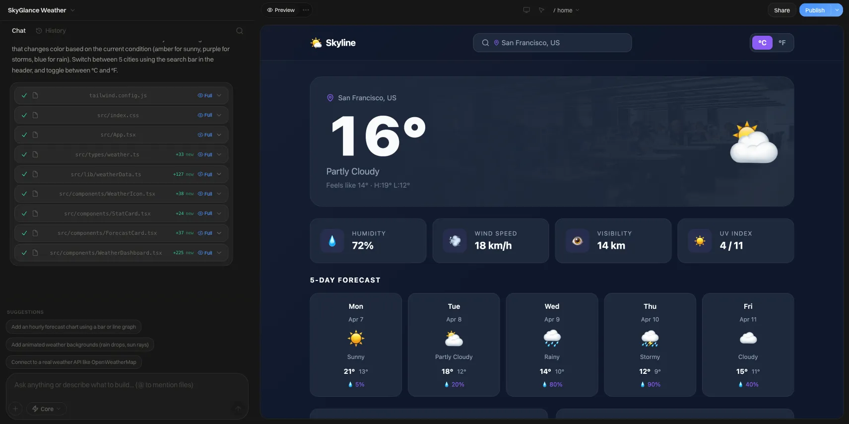
Blue Color Website: 5 Tested Blue Color Schemes
Blue color website palettes with real hex codes, contrast ratios checked for text and buttons, plus which industries lean on blue and why.
Short answer: For a blue website, pair a deep navy (#0B2545 or #0F172A) with a mid blue around #1D4ED8 for links and buttons, a pale blue tint like #DBEAFE for backgrounds, and one warm accent such as amber (#F59E0B). That combination passes WCAG contrast for body text. Avoid light blues like #3B82F6 or #60A5FA as text on white, because they measure 3.68:1 and 2.54:1, below the 4.5:1 minimum.
The five palettes below include hex codes and contrast ratios I calculated with the WCAG relative-luminance formula. Copy them as-is or adjust one color at a time and re-check.
Why blue works (and where it falls short)
Blue is the default hue for software, finance and healthcare sites because it reads as calm and dependable, and visitors expect it there. The cost is sameness. If your base color is blue, your accent color, type and imagery have to do the work of making you recognizable.
The second issue is technical. Blue has low luminance compared with yellow or green, so mid and light blues lose contrast against white quickly. Most "my blue site looks washed out" problems are really contrast problems.
Contrast quick reference for common blues
WCAG 2.x thresholds: 4.5:1 for normal text, 3:1 for large text and UI components.
| Blue | Hex | On white | Verdict |
|---|---|---|---|
| Navy | #0B2545 | 15.39:1 | Text, headers, any size |
| Deep blue | #1E3A8A | 10.36:1 | Text, headers, any size |
| Royal blue | #1D4ED8 | 6.7:1 | Text, links, buttons |
| Bright blue | #2563EB | 5.17:1 | Links and buttons, passes narrowly |
| Ocean blue | #0369A1 | 5.93:1 | Text, links, buttons |
| Azure | #3B82F6 | 3.68:1 | Large text and icons only |
| Sky | #60A5FA | 2.54:1 | Decoration only, fails everything |
Five blue website color schemes
1. Corporate navy and amber
Built for trust with a single warm call to action. Common for consulting, legal, accounting and B2B services.
| Role | Hex | Pairing and ratio |
|---|---|---|
| Header and footer | #0B2545 | White text: 15.39:1 |
| Primary links and buttons | #1D4ED8 | White text: 6.7:1 |
| Accent (CTA on navy) | #F59E0B | Navy text on amber: 7.16:1 |
| Page background | #FFFFFF | Body text #0F172A: about 17:1 |
| Muted text | #475569 | On white: 7.58:1 |
Use amber only for the one action you most want clicked. Amber text on white fails contrast, so keep it as a fill with dark text.
2. Soft SaaS blue
A light, airy layout with tinted sections. Common for software products, dashboards and apps.
| Role | Hex | Pairing and ratio |
|---|---|---|
| Background | #F8FAFC | Text #0F172A: 17.06:1 |
| Links | #1D4ED8 | On #F8FAFC: 6.41:1 |
| Button | #2563EB | White text: 5.17:1 |
| Tinted section | #DBEAFE | Text #1E3A8A: 8.49:1 |
The tinted band lets you separate sections without borders or shadows.
3. Dark mode midnight
For developer tools, analytics products and portfolios.
| Role | Hex | Pairing and ratio |
|---|---|---|
| Background | #0F172A | Body text #E2E8F0: 14.48:1 |
| Accent blue | #38BDF8 | On background: 8.33:1 |
| Secondary accent | #FB923C | On background: 7.89:1 |
On dark backgrounds the rule flips: light blues pass, and the deep blues from the first two palettes would disappear. Do not reuse #1D4ED8 for text here.
4. Ocean and teal
An analogous scheme that reads as fresh and clinical. Common for healthcare, wellness, water and environmental brands.
| Role | Hex | Pairing and ratio |
|---|---|---|
| Primary | #0369A1 | White text: 5.93:1 |
| Secondary | #0F766E | White text: 5.47:1 |
| Deep text and headings | #13315C | On white: 12.95:1 |
| Background | #FFFFFF | Alternate with #F8FAFC |
5. Navy and slate neutral
Almost monochrome, with blue as the structure rather than the highlight. Works for portfolios, editorial sites and professional practices.
| Role | Hex | Pairing and ratio |
|---|---|---|
| Headings | #0B2545 | On white: 15.39:1 |
| Body | #475569 | On white: 7.58:1 |
| Links | #1E3A8A | On white: 10.36:1 |
| Panel | #EAF2FF | Text #0B2545: 13.66:1 |
Which industries use blue, and which shade
These are patterns, not rules:
- Finance, insurance, legal: deep navy plus white. Conservative on purpose.
- Software and SaaS: mid blues (#2563EB range) with a light tinted background and often a second accent.
- Healthcare and wellness: ocean and teal blues, lots of white space.
- Education and nonprofits: friendly mid blue with a warm accent such as orange or yellow.
- Developer tools and fintech apps: dark midnight blue with a bright sky or cyan accent.
If your industry is saturated with one of these, move one step along: a teal-leaning blue instead of royal, or a navy with an unexpected accent.
How to build your own blue palette in six steps
- Choose your dark: a navy under about #13315C for headings and header bars.
- Choose your action blue: start at #1D4ED8 and move lighter only while white text stays at or above 4.5:1.
- Add a pale tint (#DBEAFE or #EAF2FF) for section backgrounds, and confirm your dark text passes on it.
- Pick one warm accent for calls to action and test it as a fill with dark text rather than as text on white.
- Run every text-on-background pair through a contrast checker, including hover and disabled states.
- Store the colors once as named tokens so one change updates the whole site.
Checklist before you publish
- Body text is at least 4.5:1 against its background
- Large headings and icons are at least 3:1
- Links are distinguishable by more than color alone (underline or weight)
- Buttons keep 4.5:1 label contrast in hover and focus states
- No light blue (#60A5FA or lighter) is used as text on white
- Only one accent color competes with the blue
- Dark-mode blues were chosen separately, not inverted
For more on why contrast failures cost readability, see bad color contrast examples. If you want stronger ratios across the board, high contrast color palettes goes further. For choosing colors that support sign-ups and sales, read best website color schemes for conversions, and the broader website color schemes guide covers other base hues. If you work in Tailwind, the Tailwind CSS colors guide maps blue shades to class names; several hex codes above come from that scale. New to the vocabulary? See what is a color palette.
Putting a blue palette on a real site
Once you have your hex codes, apply them as a theme so buttons, links and backgrounds stay consistent. Building a site on We.Inc is free: no card and no trial are needed to start; paid plans start at $20 a month. You can sign up here and paste the hex values from whichever palette above fits your industry.
Frequently asked questions
What contrast ratio does blue text need on a website?
WCAG 2.x asks for at least 4.5:1 for normal body text and 3:1 for large text (roughly 24px regular or 18.66px bold and up) and for UI components such as button borders and icons. Blue is where sites most often miss this: #3B82F6 on white measures 3.68:1, so it fails for body text, while #1D4ED8 on white measures 6.7:1 and passes comfortably.
What colors go well with blue on a website?
White and very light grays give the cleanest, most readable pairing. For an accent, amber or orange contrasts strongly with navy (#F59E0B on #0B2545 measures 7.16:1). Teal and sky blue work as analogous accents when you want a calmer look. Keep one accent color for calls to action so it stays visible.
Is blue a good color for a business website?
It is a safe and widely used choice, and that is both its strength and its weakness. Visitors read blue sites as familiar, which suits banks, software, healthcare and consulting. If every competitor also uses blue, differentiate with a distinctive accent color, typography and photography rather than a different base hue.
How many blues should a website use?
Most palettes need three to four: a dark blue for headers and text-on-light, a mid blue for buttons and links, a pale tint for section backgrounds, and sometimes a lighter blue for dark mode. More than that tends to make hierarchy muddy. Define each as a named color token once and reuse it everywhere.
What is the best blue for buttons?
Pick a blue where white button text clears 4.5:1. #2563EB with white text measures 5.17:1 and #1D4ED8 measures 6.7:1, both passing. Lighter blues like #3B82F6 (3.68:1) fail for normal-size button labels unless the text is large and bold enough to qualify for the 3:1 threshold.
More in Blog
- Bluehost AI Website Builder Reviews (2026): Price, Limits
- How BrightPath Education Grew Revenue 3× After Rebuilding Their Site on We.Inc
- 7 Powerful Examples of Business Automation for Success
- How to Insure a Startup Business: What Founders Need to Know
- Business Process Optimization: A Step-by-Step Method
- Business Website Examples: 10 Types and What Each Does Well
- Must-Have Pages for a Business Website: The Full List
- Can You White-Label Webflow? What Agencies Actually Get
Related guides and tools
Start building
- how to make a website
- AI website builder
- free website builder
- website templates
- website builders by industry
How we research, test and update this page: our editorial policy. We.Inc is our own product.
Product
Who It's For
- For Agencies
- For Freelancers
- For Hosting Providers
- For SaaS Platforms
- For Startups
- For Financial Services
- For Healthcare
Features
Resources
- Blog
- Help Center
- Free Business Tools
- Free UI Components
- Website Templates
- Template Collections
- Website Examples
- Guides
- Comparisons
- Alternatives
- Best Lists
- Reviews
- Pricing Guides
- Use Cases
- Glossary & Guides
- Integrations
- Developers
- Benchmark
- Windows App