
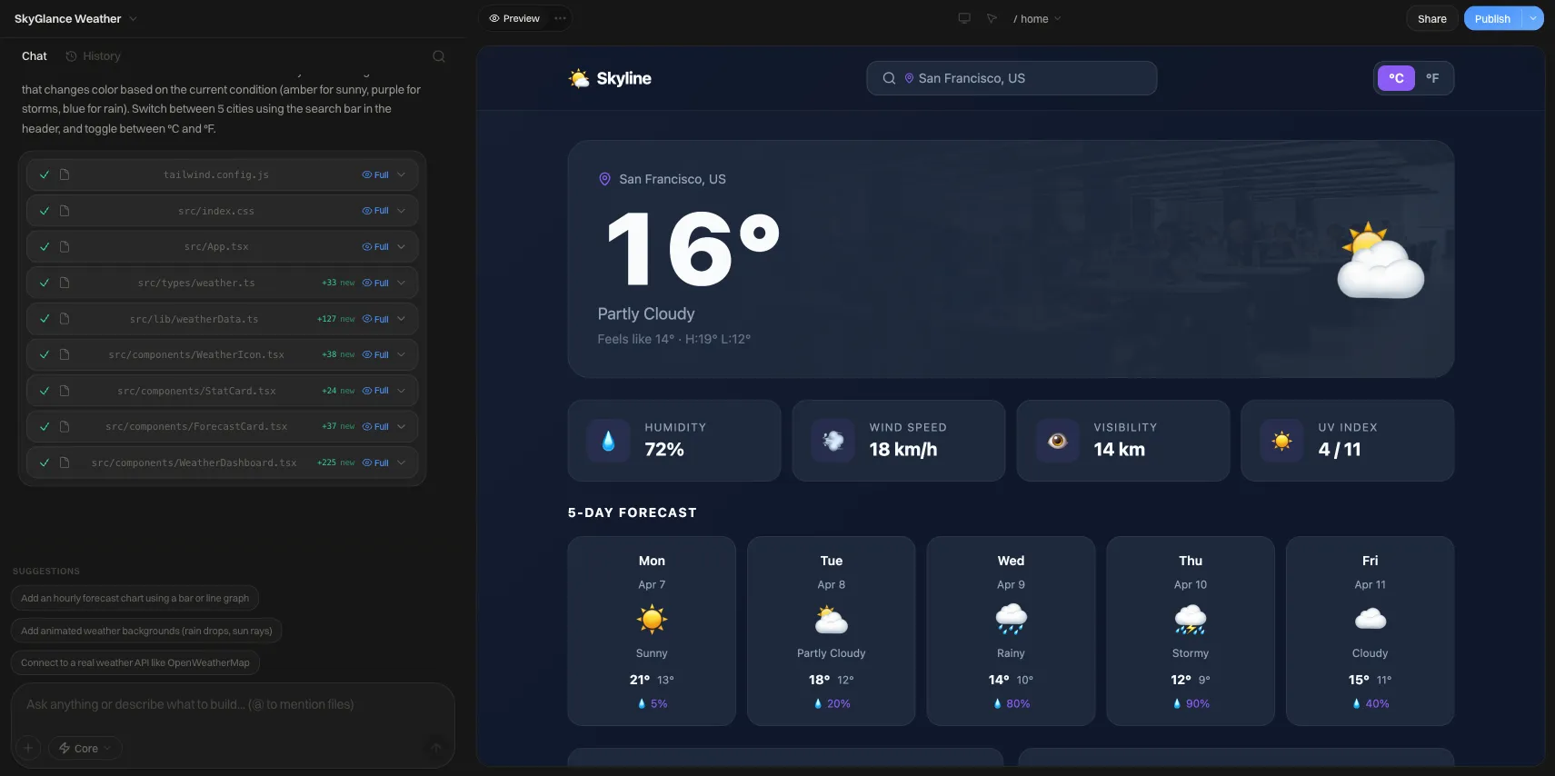
Website Wireframe Examples: 4 Text Samples You Can Copy
Website wireframe samples for a homepage, service page, product page and landing page, written block by block, plus a simple way to make your own.
Short answer: A website wireframe sample is a block-by-block layout of a page with no styling: a header, a hero, proof, details, and a call to action, each labeled with its job. Below are four copyable text wireframes (homepage, service page, product page, landing page) and a six-step method for making your own.
Why text wireframes work
A text wireframe is a numbered list of blocks, top to bottom, with a one-line note on what each block must do. It is fast to write, easy to reorder, and nobody can argue about fonts because there are none. Once the order feels right, you can redraw it as boxes or build it directly. For the wider process of mapping pages before wireframing, see the user flow and wireframes guide, and for the definition, see what is a wireframe.
Each sample below uses the same notation:
- [Block name] is the section.
- The line after it says what goes in it.
- "Mobile:" notes flag what changes on a phone.
Sample 1: Homepage wireframe
Best for a small business, studio or local service that needs to explain who it is and send visitors to one next step.
```text
- [Header] Logo left. 4-5 nav links. One primary button ("Get a quote").
Mobile: logo + menu icon; button moves inside the menu or stays visible.
- [Hero] One-sentence promise. One supporting line. Primary button.
One real photo or product image on the right.
- [Trust strip] 3-5 client logos, ratings you can actually show, or a
single sentence of credentials.
- [What we do] 3 cards: service name, one line, link to its page.
- [How it works] 3 numbered steps in a row.
Mobile: steps stack vertically.
- [Proof] 1-2 real customer quotes with name and role, or a short case study.
- [Closing call to action] Repeat the hero button with a one-line reason.
- [Footer] Contact details, key links, legal links.
```
The test for a homepage: a stranger should know what you do, who it is for, and what to click within the first screen. If your hero fails that, no later block will save it. Real footers are worth planning too; see website footer design examples, and browse business website examples to see full homepages built this way.
Sample 2: Service page wireframe
Best for one specific offer (for example "kitchen remodeling" or "bookkeeping for freelancers").
```text
- [Header] Same as the homepage.
- [Page hero] Service name as the headline. One line on the outcome.
Button: "Request a quote" or "Book a call".
- [Who it is for] 3-4 bullets describing the right customer, and one line
on who it is not for.
- [What is included] A list or 2-column grid of deliverables.
- [Process] 3-5 steps from first contact to finished work.
- [Pricing signal] A "from" price, a range, or "how we price" in two sentences.
Only state numbers you will honor.
- [Proof] A relevant case study or quote for this service only.
- [FAQ] 4-6 real objections answered in 2-3 sentences each.
- [Closing call to action] Form or button, with response time if you can keep it.
- [Footer]
```
Service pages convert when the "who it is for" and "pricing signal" blocks exist. Those are the two blocks visitors scan for first and most sites leave out.
Sample 3: Product page wireframe
Best for a single product in a small shop. Keep the buy decision above the fold.
```text
- [Header] Logo, nav, search, cart icon with item count.
- [Breadcrumb] Home > Category > Product.
- [Product area, two columns]
Left: main image + 3-5 thumbnails (swipeable on mobile). Right: product name, price, short description (2 lines), option selectors (size/color), quantity, "Add to cart" button, delivery and returns note.
- [Details tabs or accordion] Description, materials or specs, care, shipping.
- [Reviews] Only real reviews from real buyers. If you have none yet, remove
this block rather than leave it empty.
- [Related products] 3-4 cards, same style as the category page.
- [Footer] Shipping, returns, contact, legal.
```
Mobile note: pin the "Add to cart" button to the bottom of the screen once the user scrolls past it. Image alt text matters on this page, so plan it now using alt text examples.
Sample 4: Landing page wireframe
Best for one campaign, one audience, one action. Remove the main navigation so nothing competes with the button.
```text
- [Header] Logo only. No nav links.
- [Hero] Headline that repeats the promise from the ad or email.
Supporting line. Form (2-4 fields) or primary button.
- [Benefits] 3 short blocks: benefit first, feature second.
- [Proof] One strong quote or one concrete result you can verify.
- [How it works] 3 steps.
- [Objection handler] 3-4 FAQs, focused on cost, time and risk.
- [Repeat call to action] Same button or form as the hero.
- [Minimal footer] Privacy and terms links only.
```
For what to put inside each of these blocks once the structure is set, see landing page examples that convert.
Which wireframe should you start with?
| Your goal | Start with | Key block to get right | Navigation |
|---|---|---|---|
| Explain your business to new visitors | Homepage | Hero (promise + one button) | Full |
| Sell one service | Service page | "Who it is for" + pricing signal | Full |
| Sell a physical or digital product | Product page | Product area (image, price, button) | Full + cart |
| Get sign-ups or leads from an ad or email | Landing page | Hero form or button | None or minimal |
How to make a website wireframe in six steps
- Write the one goal. Complete the sentence "A visitor arrives wanting ___ and should leave having done ___." One goal per page.
- List the blocks you need. Take a sample above and delete anything that does not serve your goal. Add what is missing, such as a service area map or a booking widget.
- Order by the visitor's questions. What is this? Is it for me? Can I trust it? What does it cost? What do I do next? Put the blocks in that order.
- Write real headlines and button labels. "Get a quote" beats "Button". Placeholder words hide weak messaging.
- Draw or outline the layout. Boxes on paper, a text list, or a grid in any tool. Mark which blocks sit side by side on desktop and stack on mobile.
- Test with someone outside your project. Show it for 10 seconds, then ask what the page offers and what they would click. Fix the blocks they could not describe.
Wireframe review checklist
Copy this into your notes and tick each item before moving to visual design.
- [ ] The page has one primary goal and one primary button label.
- [ ] The first screen states what you offer and for whom.
- [ ] Proof (quotes, results, credentials) appears before the closing call to action.
- [ ] Every block has a stated job; no block exists "because other sites have it".
- [ ] Button text is specific, not "Submit" or "Click here".
- [ ] Mobile order is noted for any multi-column block.
- [ ] Forms ask only for fields you will actually use.
- [ ] Text and background pairs are planned with enough contrast; check them with bad color contrast examples as a reference.
- [ ] Legal and consent elements (privacy link, cookie notice) have a place.
From wireframe to a live site
Once the blocks are settled, you can build them in any website tool. Building a site on We.Inc is free for every account, with no card needed; paid plans start at $20 a month. Pasting your block list into the prompt is a practical way to give it structure. You can sign up here. Whatever tool you use, review the draft against your checklist, because the wireframe is the standard the finished page is judged by.
Common wireframing mistakes
- Designing in the wireframe. Colors and photos invite taste debates. Keep it gray.
- Too many calls to action. One primary action per page; secondary links are fine but should look quieter.
- Skipping mobile. Most pages get a large share of visits on phones, so sketch the stacked order too.
- Lorem ipsum everywhere. Real copy exposes layout problems early, such as a headline that needs three lines.
- Copying a competitor's layout block for block. Use samples as a starting order, then cut and add based on your own visitors' questions.
Frequently asked questions
What is a website wireframe sample?
It is a low-fidelity layout that shows which blocks sit on a page, in what order, and roughly how much space each gets. It uses boxes and plain labels instead of colors, fonts and photos, so you can judge structure before design work starts.
How detailed should a wireframe be?
Detailed enough to show the order of blocks, the purpose of each block, the main headline and button wording, and what happens on mobile. Skip colors, brand fonts and final images. If a stakeholder starts debating shades of blue, the wireframe has too much polish.
Do I need Figma or special software to wireframe?
No. Paper, a whiteboard, a spreadsheet or a plain text outline all work. The text wireframes in this article can be copied into any notes app. Dedicated design tools help when several people need to comment on the same file, but they are optional.
What is the difference between a wireframe and a mockup?
A wireframe shows structure and content priority with no visual styling. A mockup adds colors, typography, imagery and spacing so it looks like the finished page. Wireframes come first, mockups second.
How many wireframes does a small business site need?
Usually one per distinct page type, not one per page. A typical small site needs a homepage, a service or product page template, a contact or about page, and a landing page for any campaign. Pages of the same type reuse the same wireframe.
More in Blog
- Sample Wedding Website: Page-by-Page Examples and Wording
- Wedding Website FAQ: Ready-to-Copy Answers and Wording
- Wedding Website Themes: 6 Styles and How to Choose
- Wegic AI Website Builder Review (2026): Pricing, Pros, Cons
- We.Inc vs Lovable: Which AI Website Builder Should You Use in 2026?
- We.Inc vs Wix: An Honest Comparison for 2026
- What Does Link in Bio Mean? Plain-English Guide
- What Is a White Label Website? Meaning, Types and Examples
Related guides and tools
Start building
- how to make a website
- AI website builder
- free website builder
- website templates
- website builders by industry
How we research, test and update this page: our editorial policy. We.Inc is our own product.
Product
Who It's For
- For Agencies
- For Freelancers
- For Hosting Providers
- For SaaS Platforms
- For Startups
- For Financial Services
- For Healthcare
Features
Resources
- Blog
- Help Center
- Free Business Tools
- Free UI Components
- Website Templates
- Template Collections
- Website Examples
- Guides
- Comparisons
- Alternatives
- Best Lists
- Reviews
- Pricing Guides
- Use Cases
- Glossary & Guides
- Integrations
- Developers
- Benchmark
- Windows App