25 Website Layout Examples (With Annotated Wireframes) | How-to Guide
25 website layout examples from the We.Inc template library, each with a box wireframe of the page structure, a preview of the design, why the layout works and which businesses it suits. Includes a guide to choosing a layout.
A website layout is the order and arrangement of sections on a page: what comes first, what sits side by side, and where the main button goes. Below are 25 layouts, each shown as a simple box wireframe and a preview of the full design. All 25 are We.Inc template designs, not customer sites, grouped by the kind of business they suit. The blue box in each wireframe is the main call to action.
How to read the wireframes
Each row of boxes is one band of the page, from top to bottom as you scroll. Boxes side by side sit next to each other on a desktop screen; on a phone they stack in the same order, so the left box shows first. This page is about the whole-page arrangement. For the top of the page specifically, see hero section examples; for menus, see navigation examples.
Five layout patterns in one table
| Pattern | Order of sections | Best when | Examples below |
|---|---|---|---|
| Service funnel | Hero, services, proof, form | Visitors need a quote or booking | 1-8 |
| Visit | Hero, menu, story, hours and map | People come to you in person | 9-14 |
| Book or join | Hero, prices or schedule, booking | Appointments, classes, memberships | 15-19 |
| Grid | Hero, grid of items, detail, enquiry | Listings, products, portfolio | 20-24 |
| Reader | Hero, work, about, signup | The goal is a returning audience | 25 |
Service business layouts
1. Emergency trade: urgent band under the hero
Template: Ironpeak Roofing (a We.Inc template design, not a customer site).
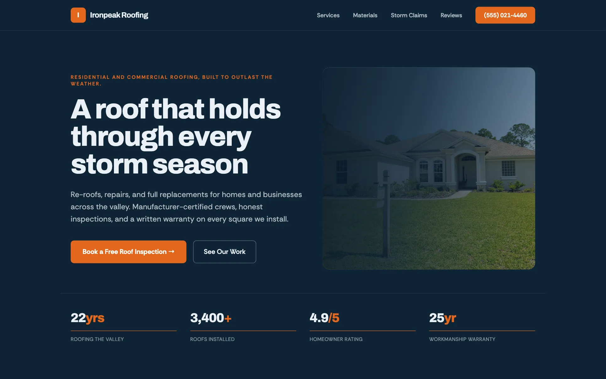
Why it works: A full-width coloured band right under the hero catches people with an urgent problem (storm damage) before they scroll past. Use it for: Roofers, restoration, locksmiths, towing.
2. Multi-trade with a service-area block
Template: Summit Trades (a We.Inc template design, not a customer site).
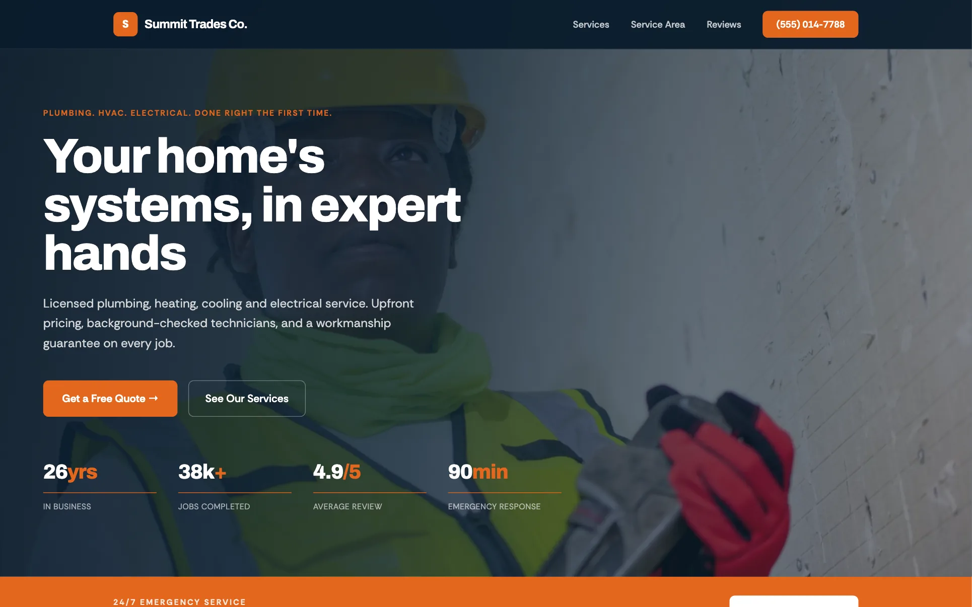
Why it works: Three equal service cards, then a named list of areas served, answers "do you do this, here?" in two scrolls. Use it for: Any business with a defined travel area.
3. Service list with a featured specialty
Template: Voltline Electric (a We.Inc template design, not a customer site).
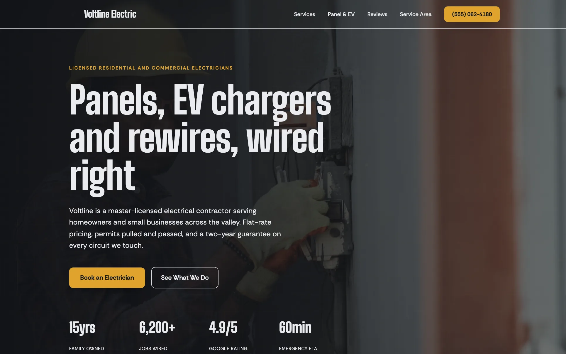
Why it works: One high-value service gets its own section, so the page sells the job you most want without hiding the rest. Use it for: Trades with one profitable specialty.
4. Checklist and instant quote
Template: Brightwell Cleaning (a We.Inc template design, not a customer site).
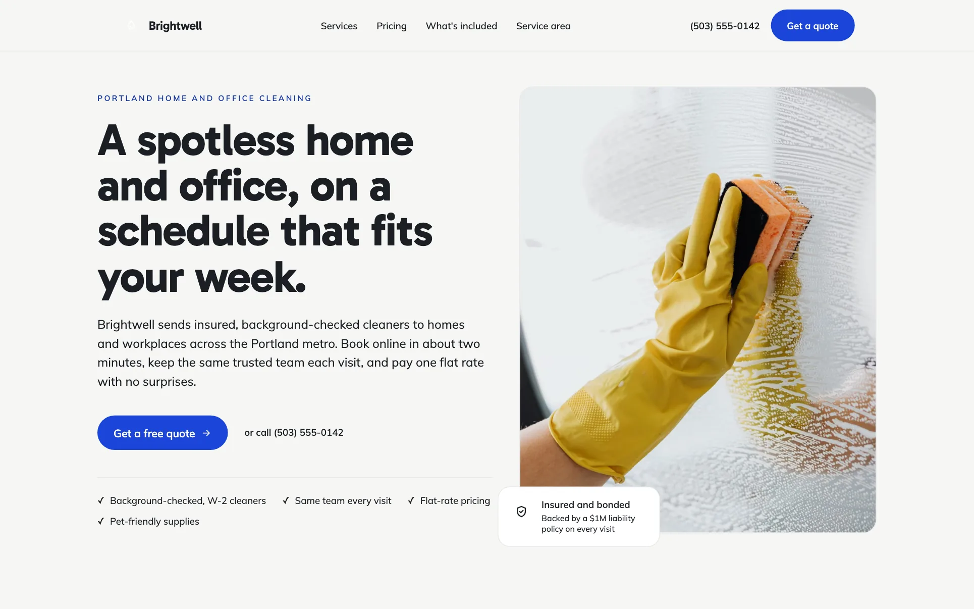
Why it works: A visible checklist of what every visit includes answers the main worry (what exactly do I get?) before the price form. Use it for: Cleaning, lawn care, pool service.
5. Local craftsman story
Template: Halden Woodworks (a We.Inc template design, not a customer site).
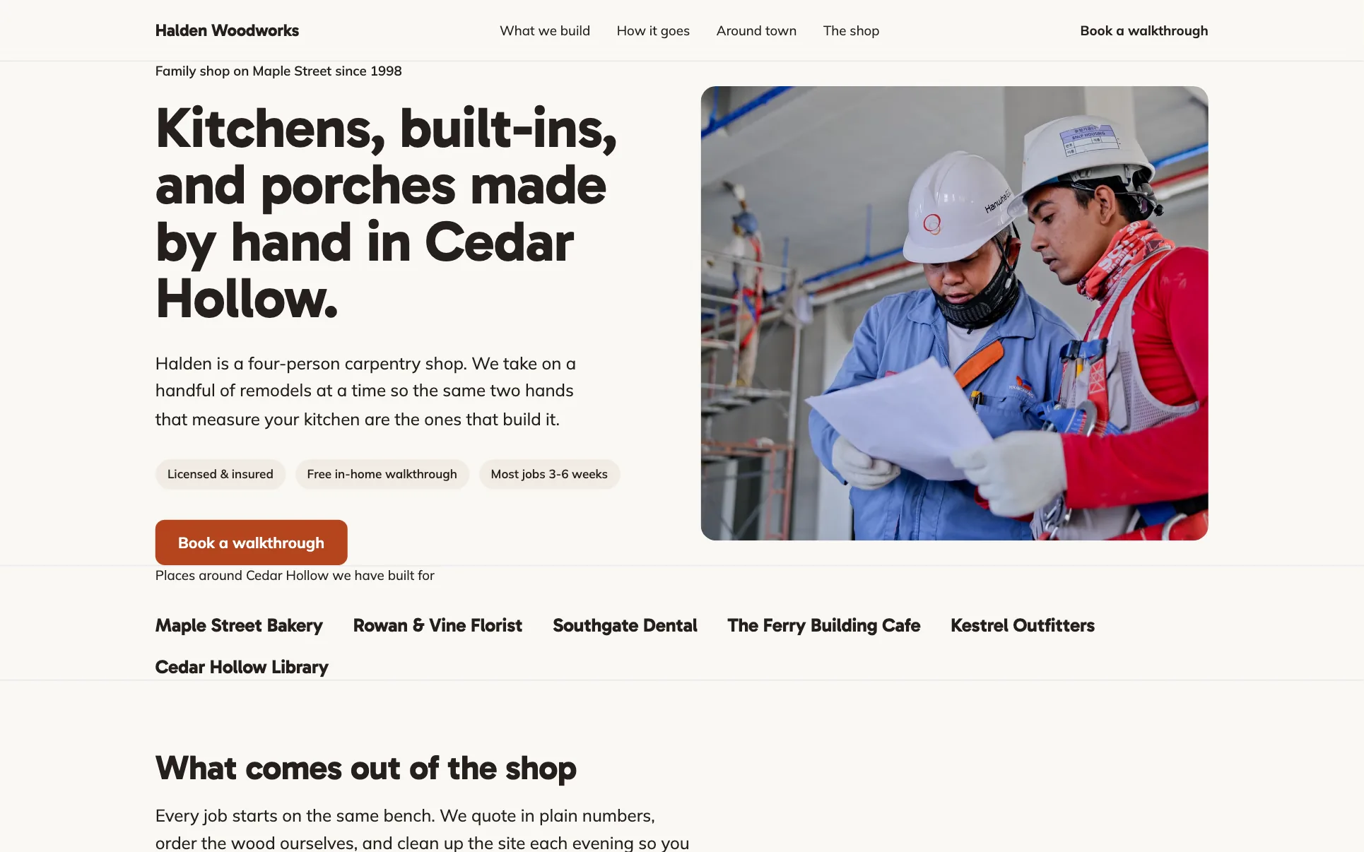
Why it works: Naming the town in the headline and showing "how a job goes" builds trust for big, one-off jobs. Use it for: Carpenters, builders, remodelers.
6. Professional firm: practice areas and people
Template: Sterling & Vance LLP (a We.Inc template design, not a customer site).
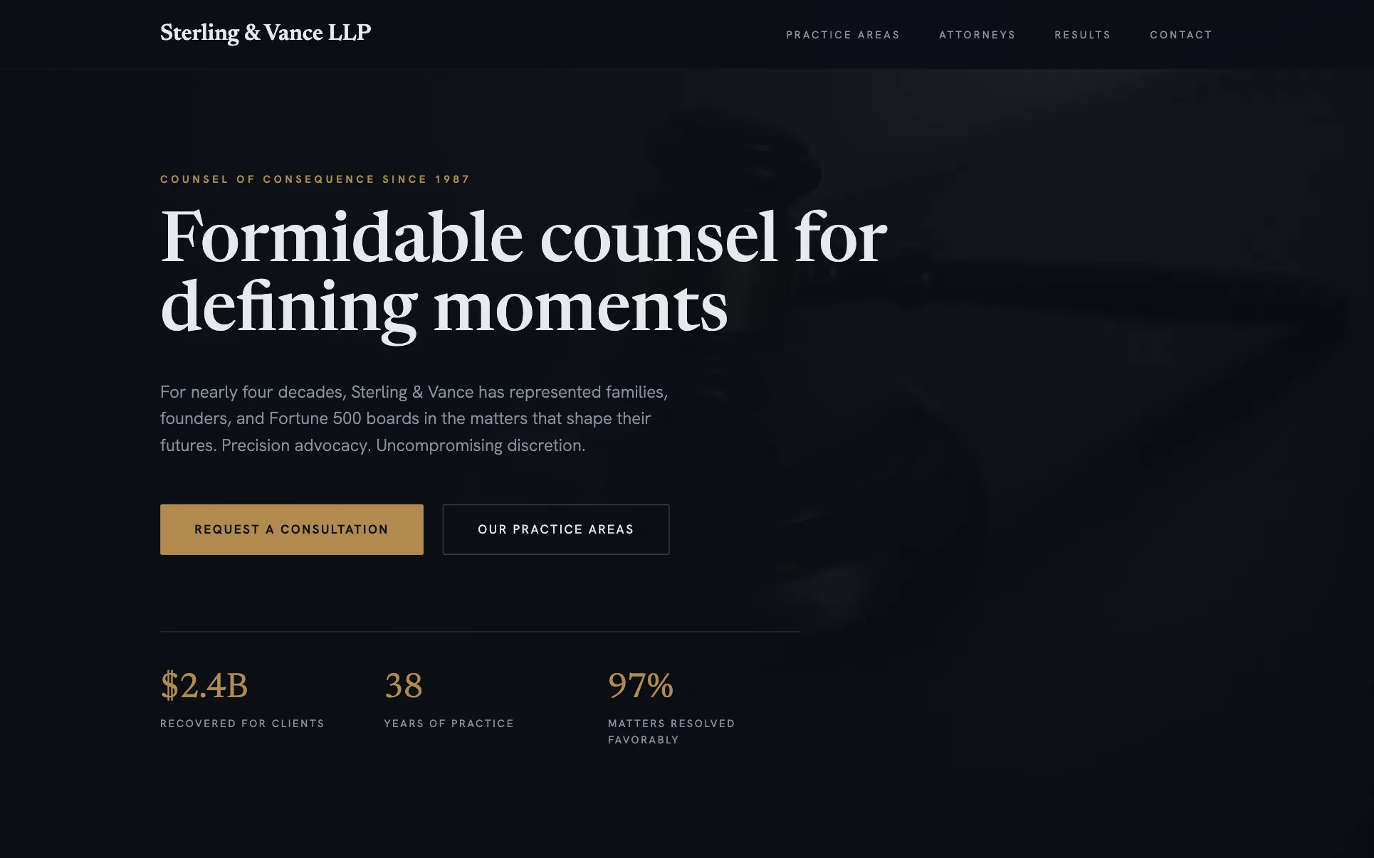
Why it works: People choose a firm by area of law and then by the person; the layout follows that order. Use it for: Law, accounting, financial advice.
7. Consultancy: proof first
Template: Linden Consult (a We.Inc template design, not a customer site).
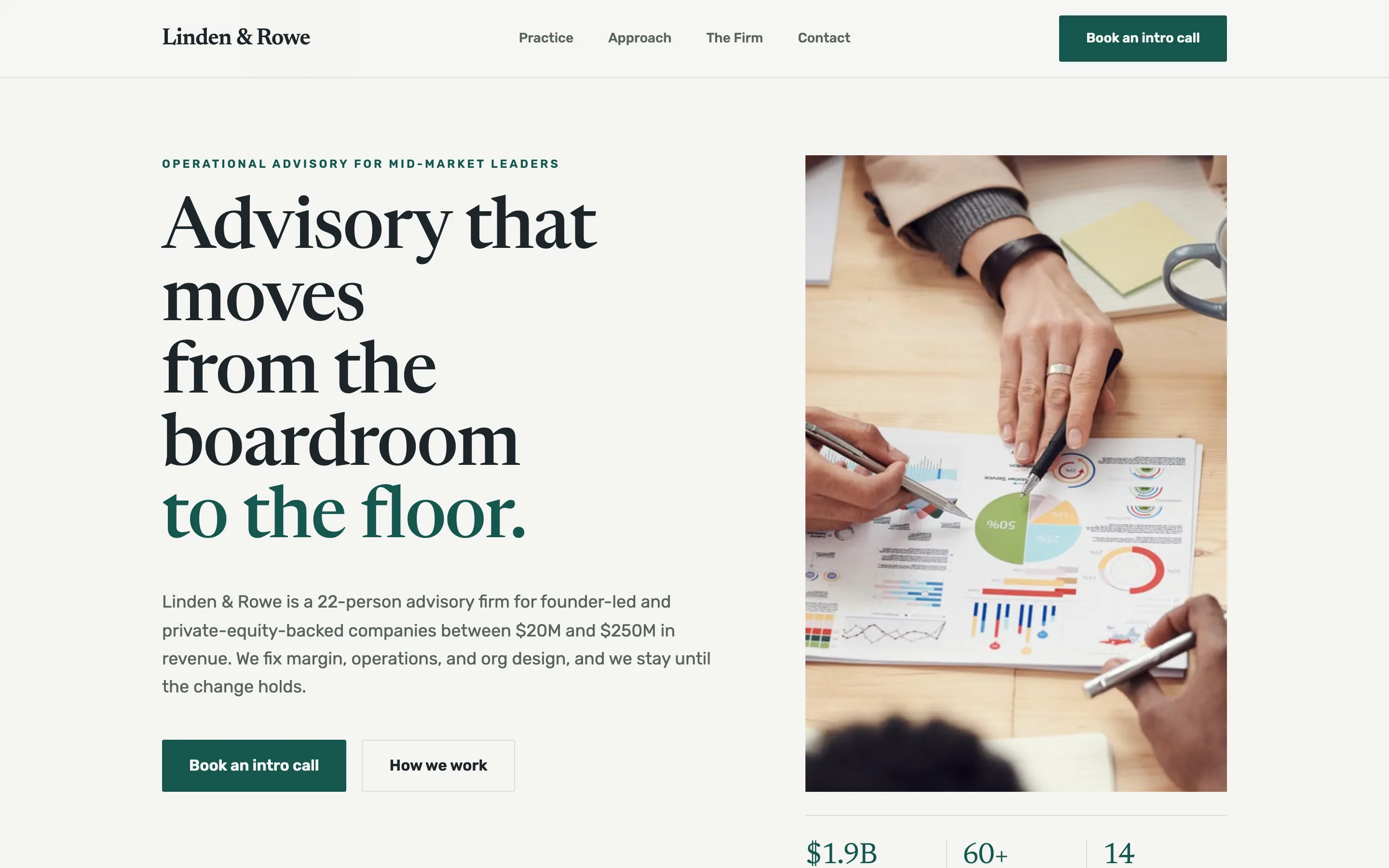
Why it works: Proof sits straight after the hero, then the page frames services as problems the buyer recognises. Use it for: Consultants, coaches, B2B services.
8. Short accountant page
Template: Ledgerline CPA (a We.Inc template design, not a customer site).
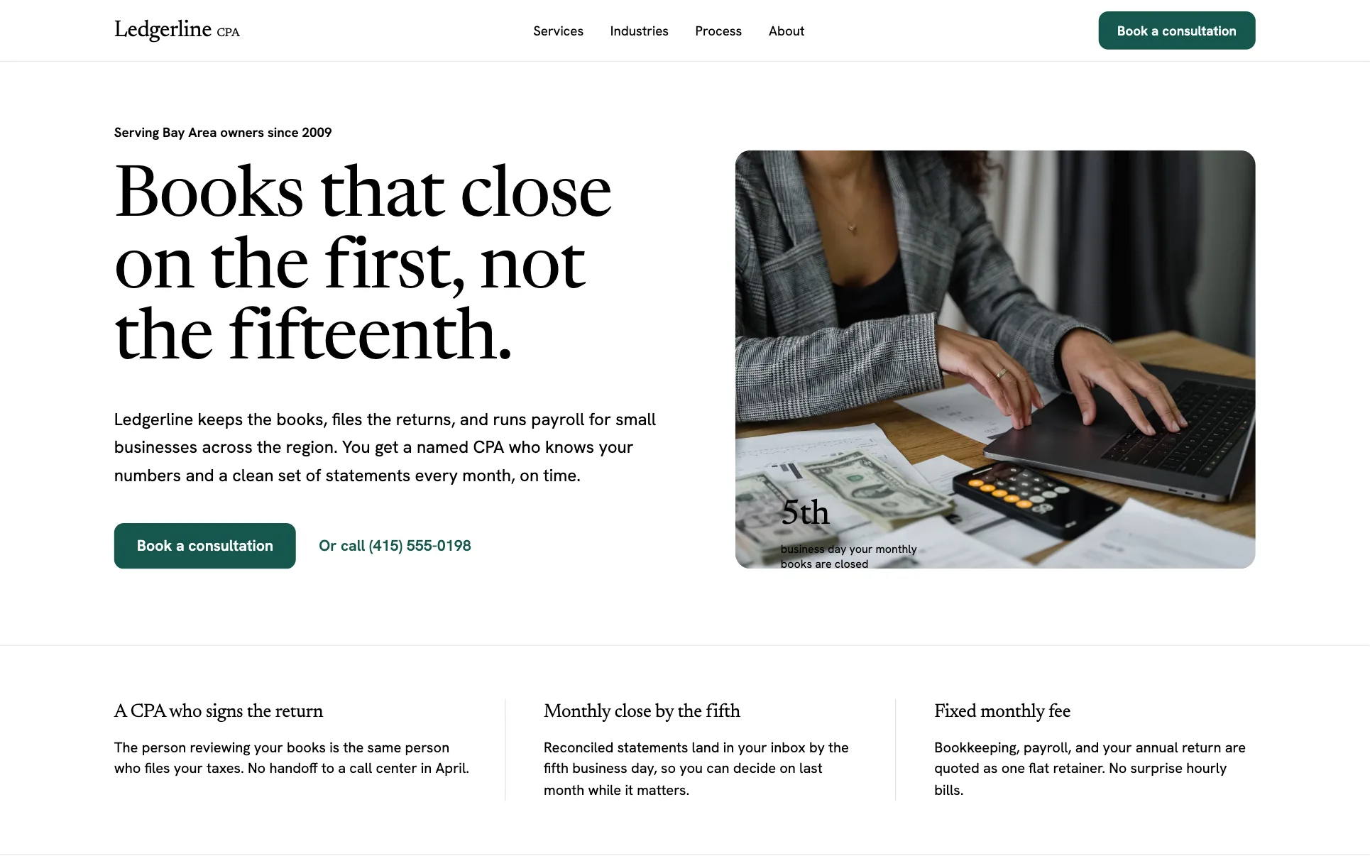
Why it works: Four sections. For a buyer who already knows they need an accountant, less is faster. Use it for: Any service where the buyer arrives decided.
Food and hospitality layouts
9. Café: menu, story, visit
Template: Ember & Roast (a We.Inc template design, not a customer site).
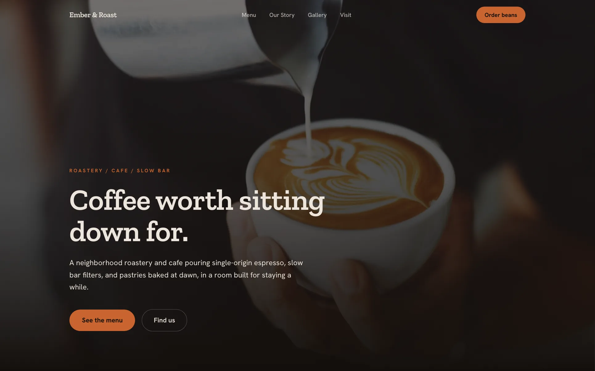
Why it works: Menu first, visit last: people check what you serve, then where and when. Use it for: Cafés, bakeries, bars.
10. Bakery with order-ahead
Template: Flour & Fern (a We.Inc template design, not a customer site).
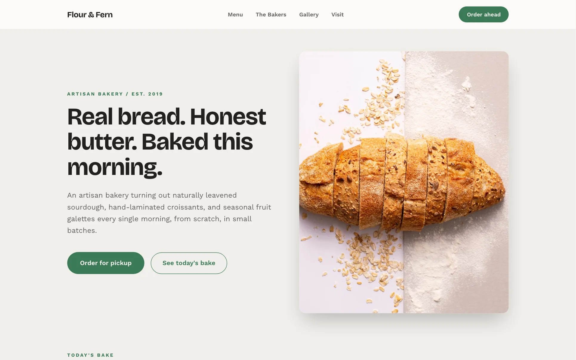
Why it works: A dedicated order section turns browsing into pre-orders. Use it for: Bakeries, butchers, meal prep.
11. Restaurant long scroll
Template: Azafran (a We.Inc template design, not a customer site).
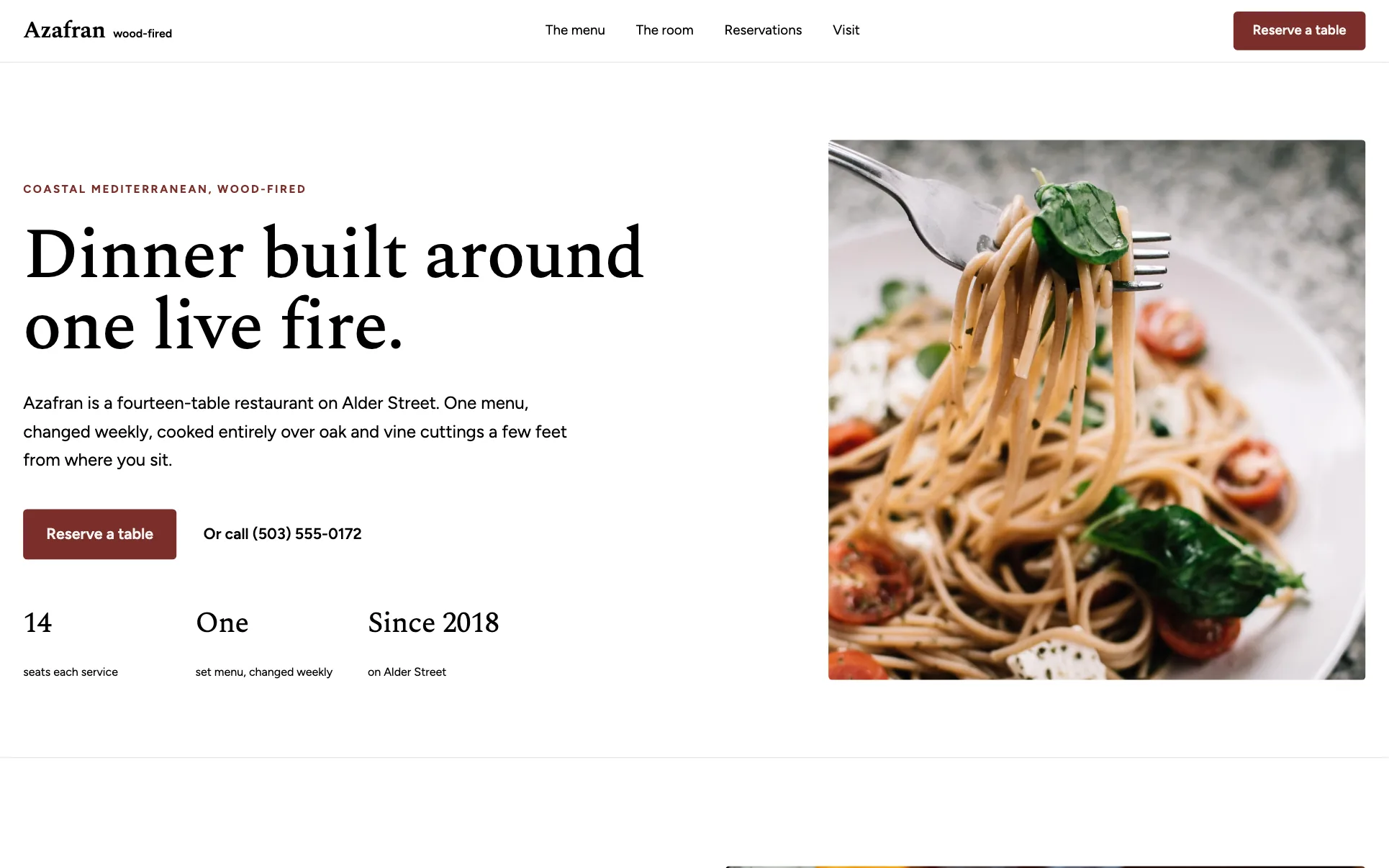
Why it works: For a destination restaurant, atmosphere sells the booking, so the page tells a story before asking. Use it for: Fine dining, tasting menus, venues.
12. Three-section restaurant
Template: Crust (a We.Inc template design, not a customer site).
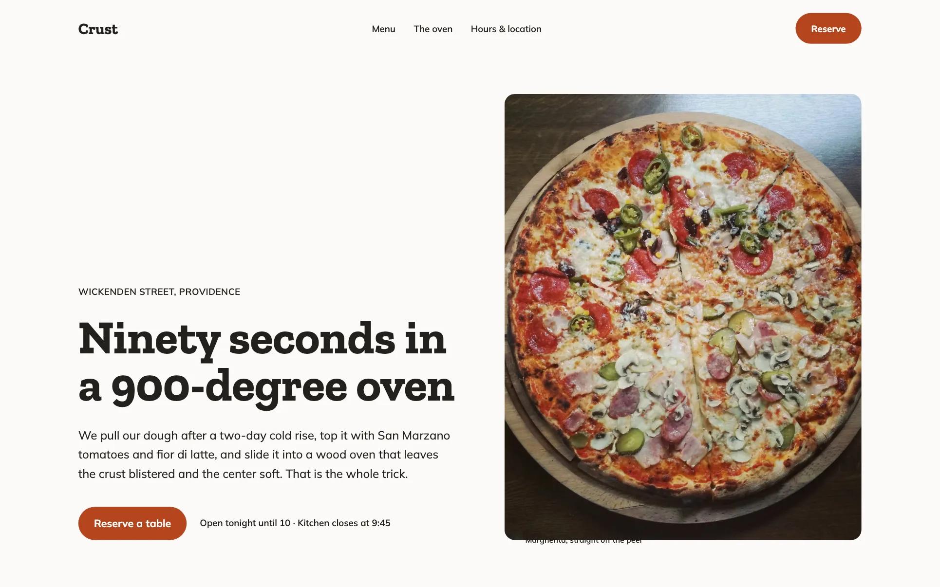
Why it works: Hero, menu, visit. The fewest sections a restaurant can have and still answer every question. Use it for: Casual restaurants, takeaways.
13. Schedule first
Template: ROAM (a We.Inc template design, not a customer site).
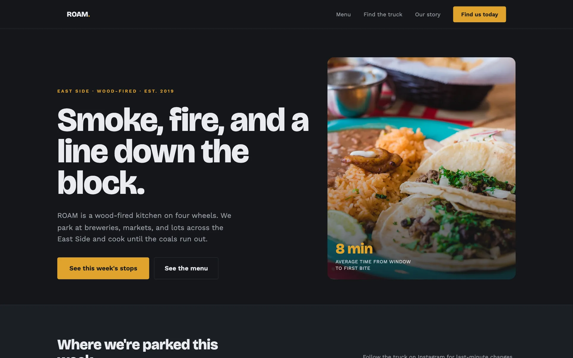
Why it works: When location changes daily, "where are you today" is the main question, so it goes right under the hero. Use it for: Food trucks, markets, pop-ups.
14. Event service with enquiry form
Template: Harvest & Vine (a We.Inc template design, not a customer site).
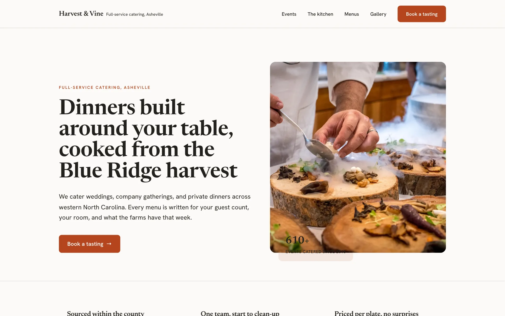
Why it works: Event types up front let the visitor self-sort; a sample menu makes the price feel concrete. Use it for: Caterers, planners, venues.
Booking and membership layouts
15. Booking-led salon
Template: Lumé Salon & Beauty Spa (a We.Inc template design, not a customer site).
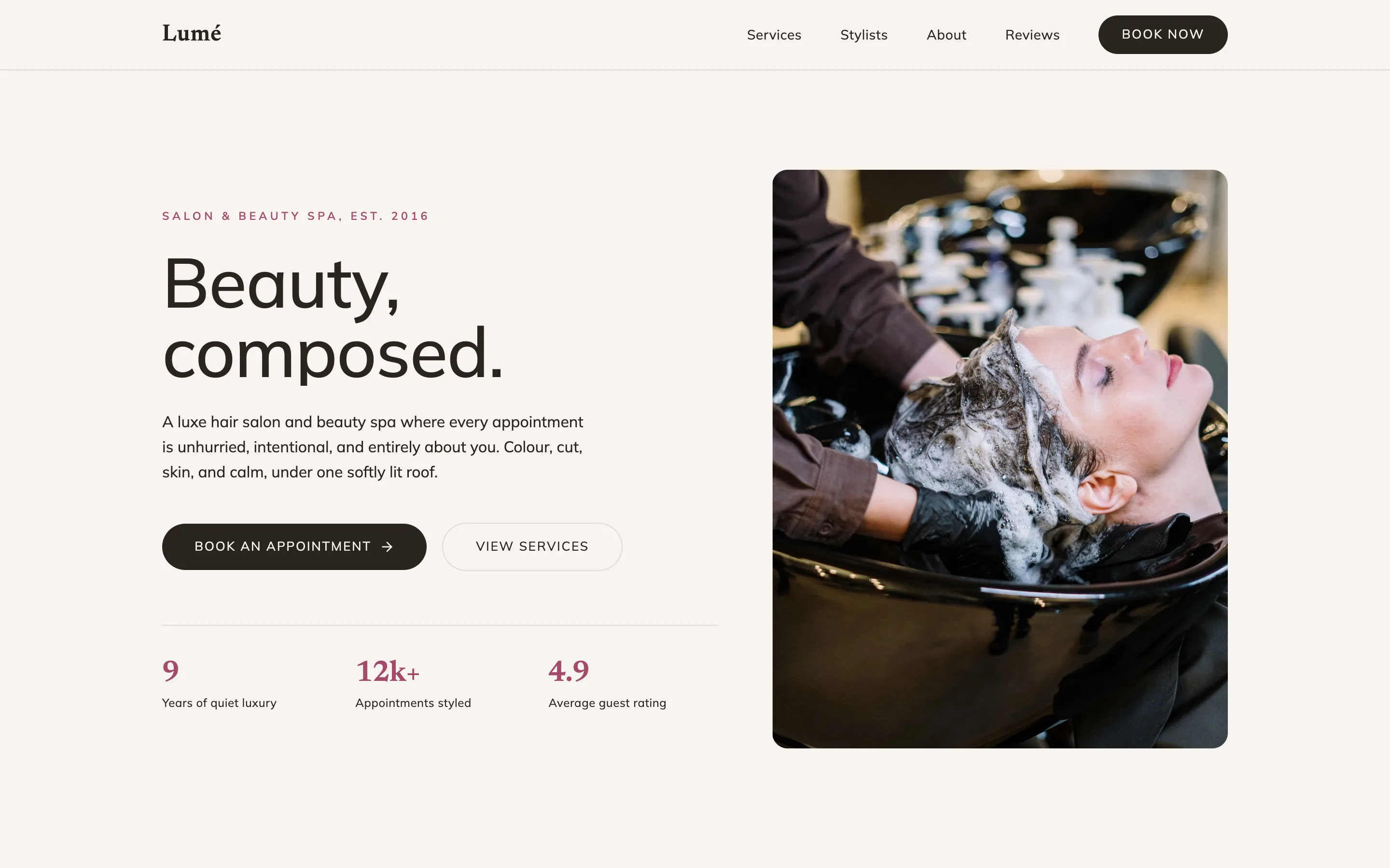
Why it works: A price list and a booking block are all most salon visitors need. Use it for: Salons, barbers, nail and lash studios.
16. Class schedule and pricing
Template: Tidewater Yoga (a We.Inc template design, not a customer site).
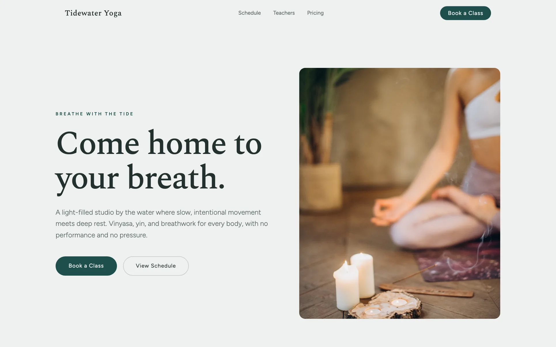
Why it works: Schedule then prices then a first-visit offer follows the decision a new student makes. Use it for: Yoga, pilates, dance, martial arts.
17. Gym with programmes and tiers
Template: Iron (a We.Inc template design, not a customer site).
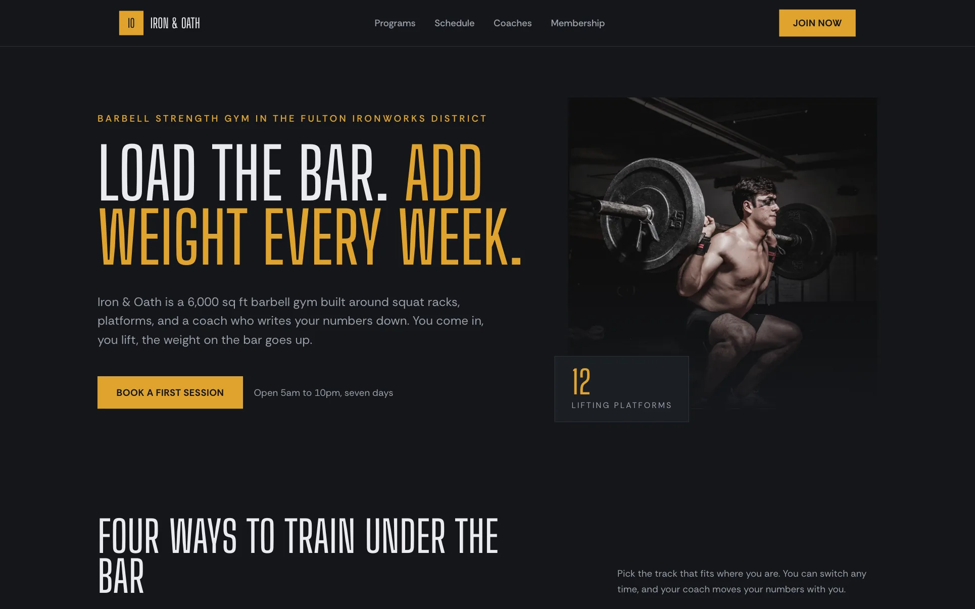
Why it works: Membership tiers side by side make comparison easy; a free first session lowers the step. Use it for: Gyms, clubs, memberships.
18. Clinic: care, team, location
Template: Verdant Family Health (a We.Inc template design, not a customer site).
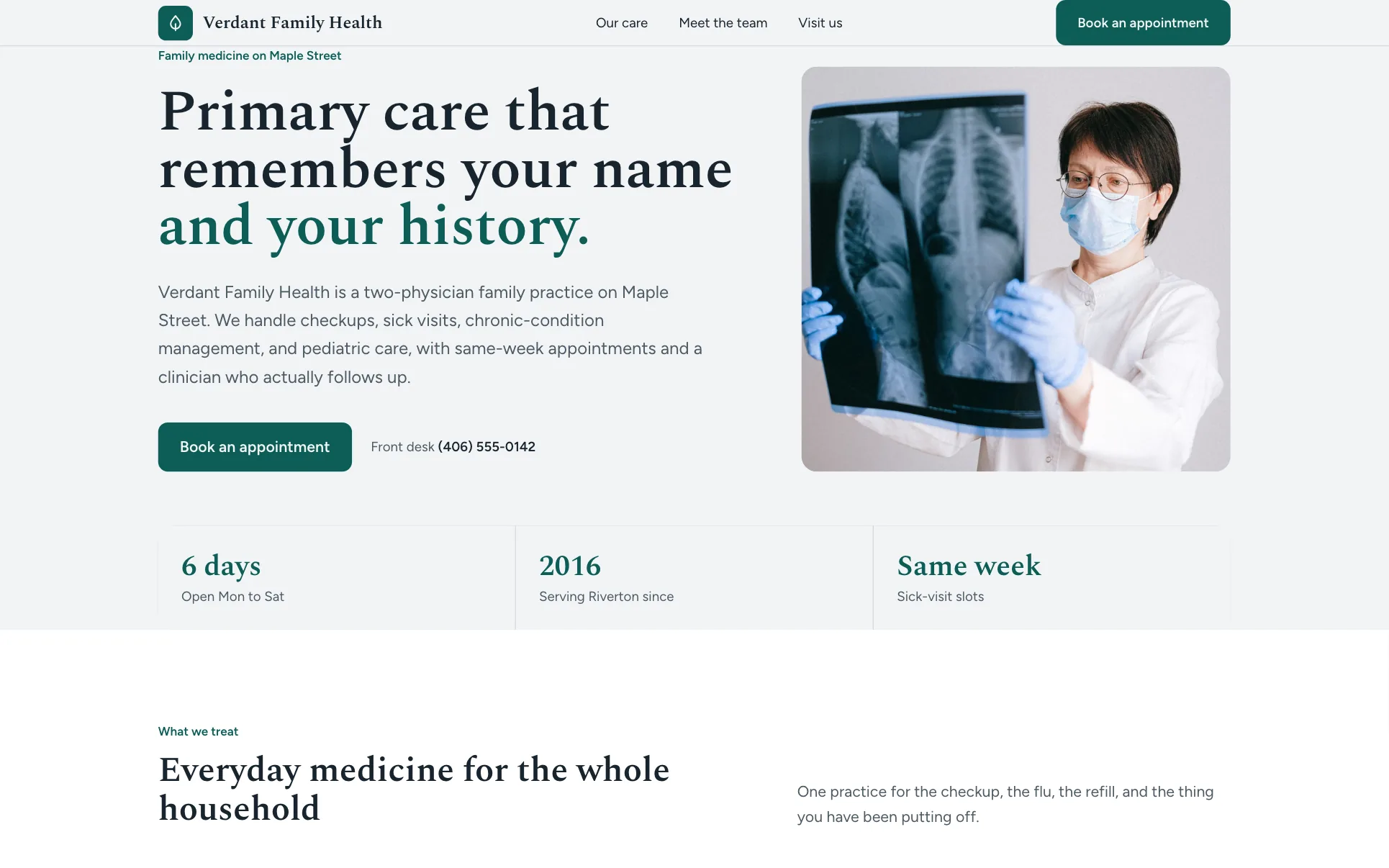
Why it works: Patients want to know what you treat, who they will see and how to get there. Use it for: Clinics, dentists, physios.
19. Vet with urgent note
Template: Meadowpaw Veterinary (a We.Inc template design, not a customer site).
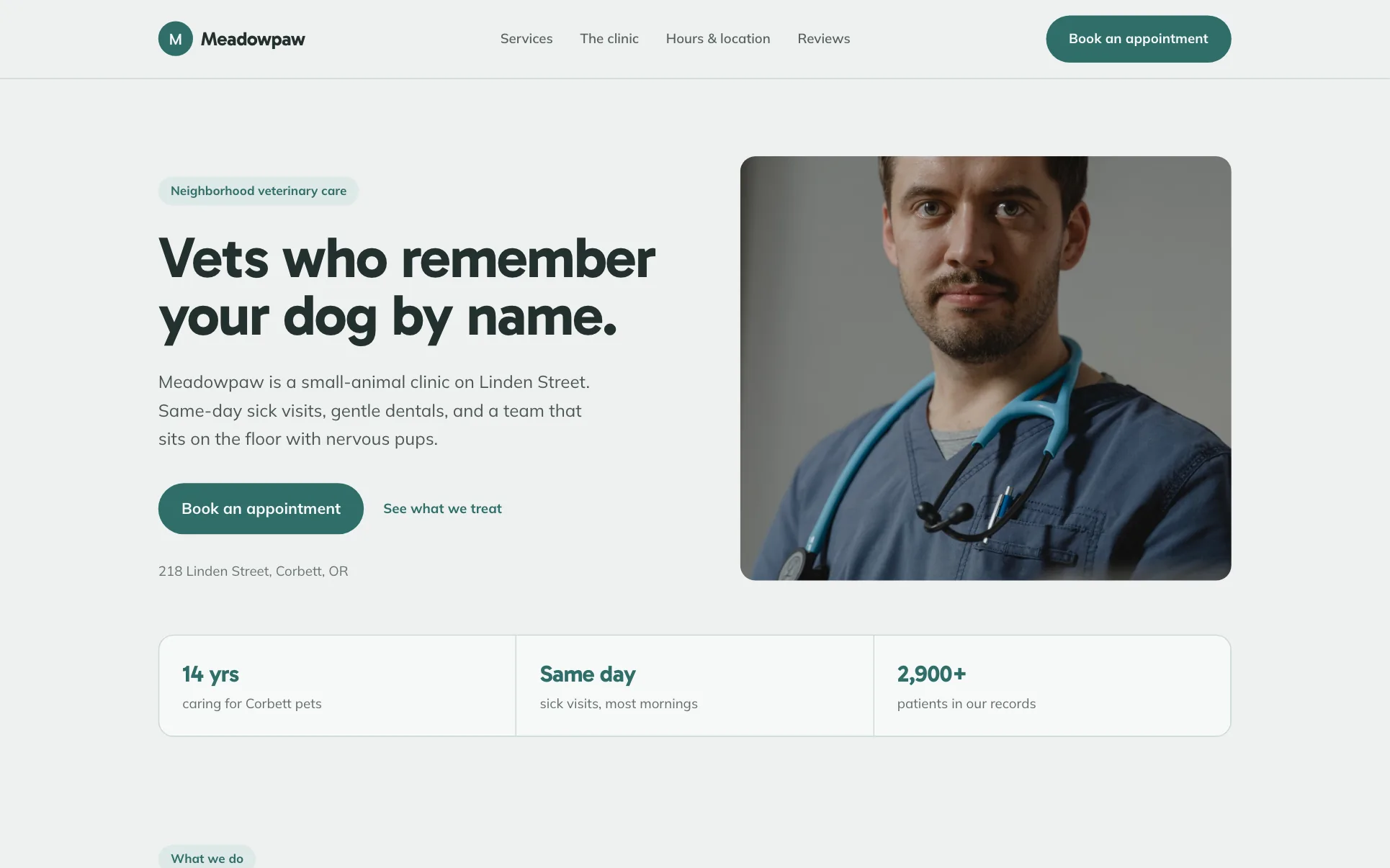
Why it works: The visit section tells urgent cases to phone, so the booking form is not used for emergencies. Use it for: Vets, urgent care, any service with emergencies.
Grid layouts: listings, shops and portfolios
20. Listings grid
Template: Keystone Realty (a We.Inc template design, not a customer site).
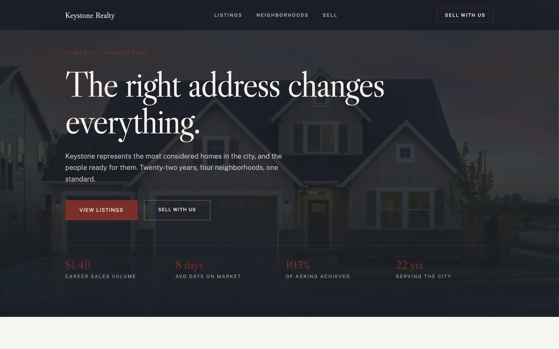
Why it works: Buyers get the grid; sellers get their own section and a separate call to action. Use it for: Real estate, rentals, car dealers.
21. Single product page
Template: Verre Halo (a We.Inc template design, not a customer site).
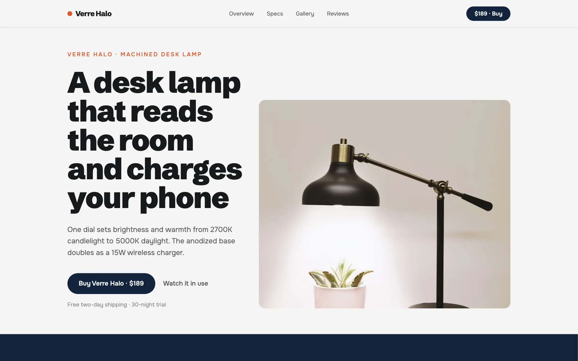
Why it works: The price sits in the menu bar and at the end; everything between answers "is it worth it?" Use it for: One-product brands, launches, crowdfunded products.
22. Small-batch shop
Template: Cellar & Rowan (a We.Inc template design, not a customer site).
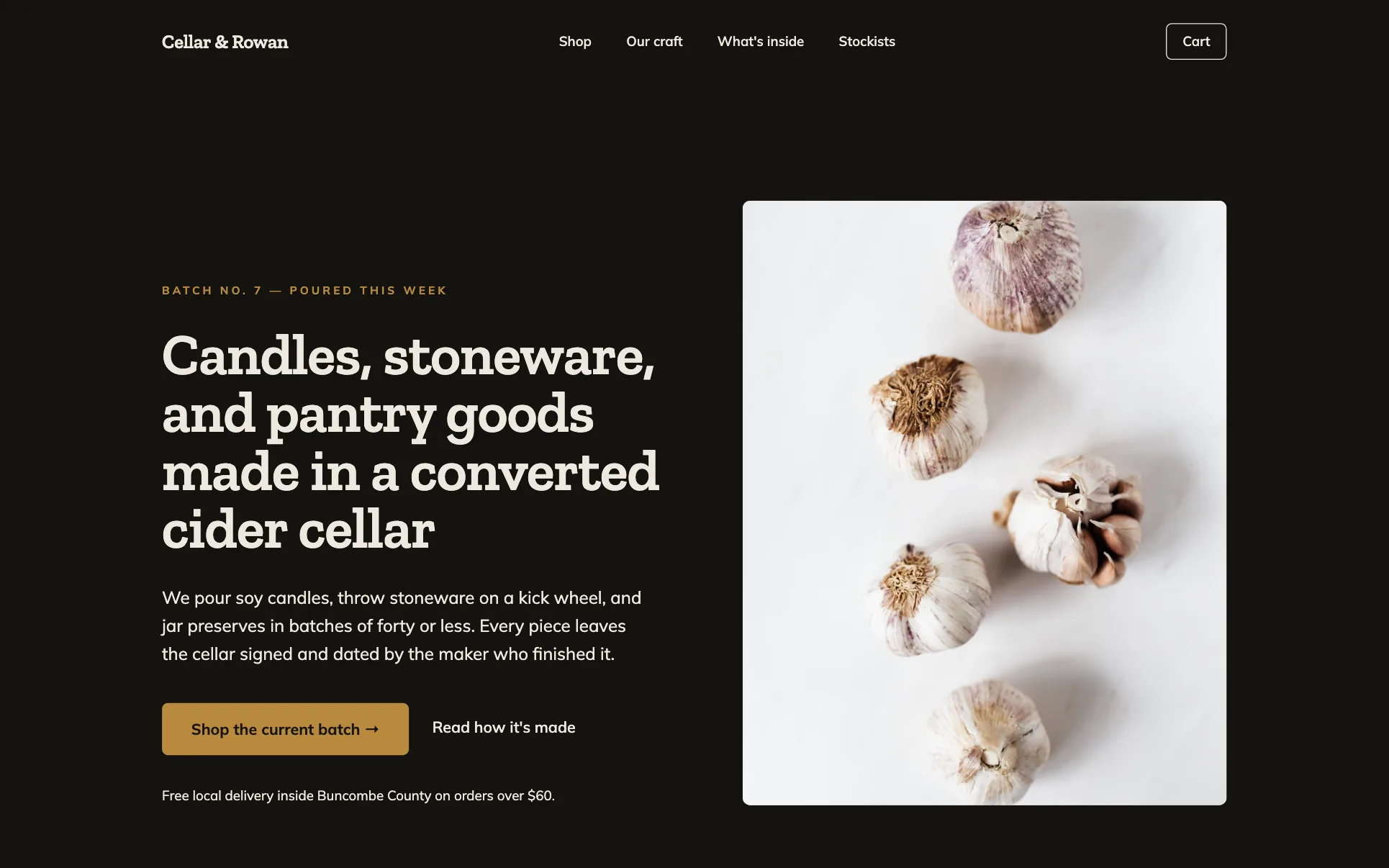
Why it works: Products first, then the story that justifies the price, then a list signup for the next batch. Use it for: Makers, candles, ceramics, food.
23. Product drop
Template: Loop (a We.Inc template design, not a customer site).
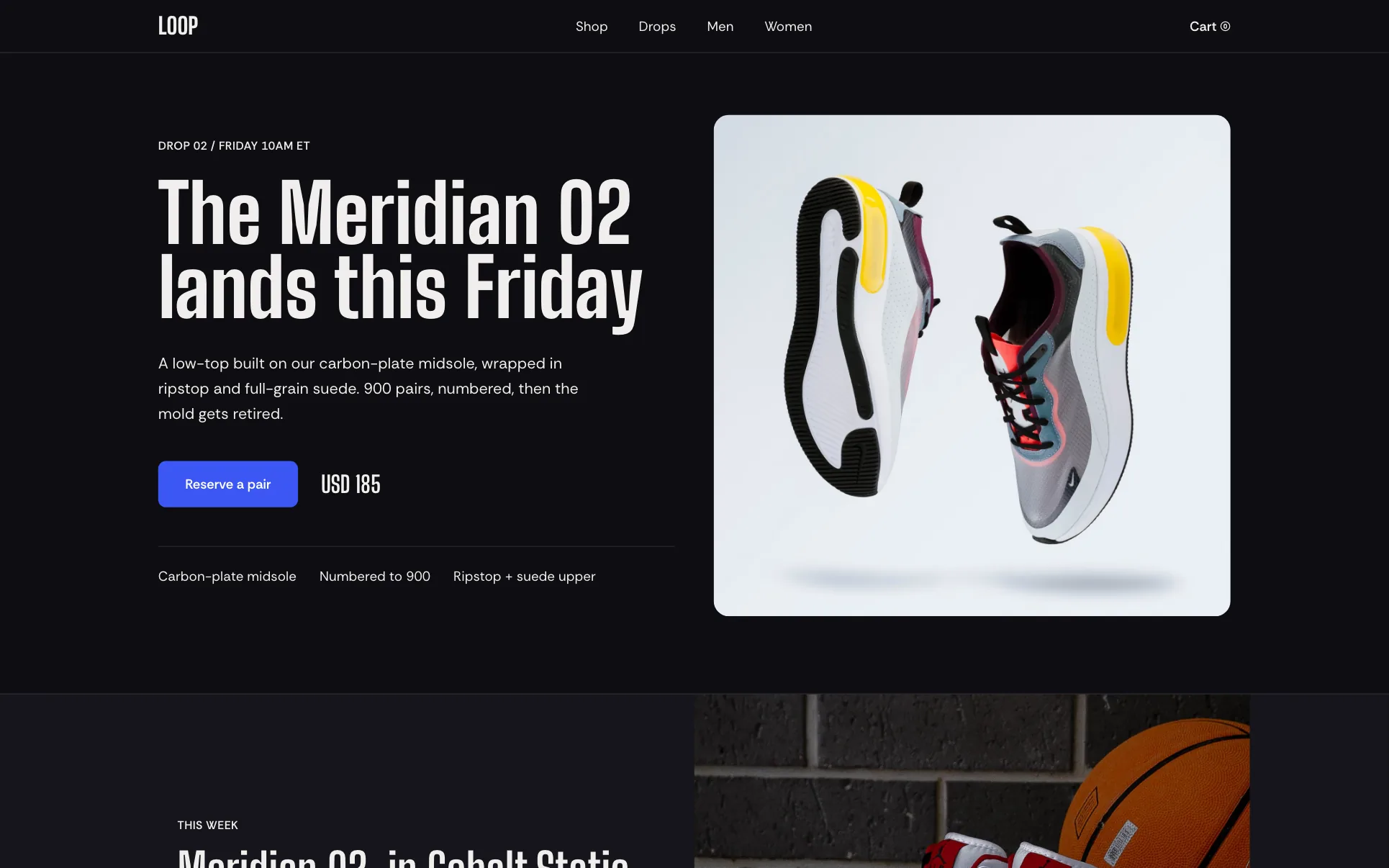
Why it works: The next release leads; the shop grid serves people who want something now. Use it for: Limited runs, apparel, collectibles.
24. Portfolio grid first
Template: Drafthouse (a We.Inc template design, not a customer site).
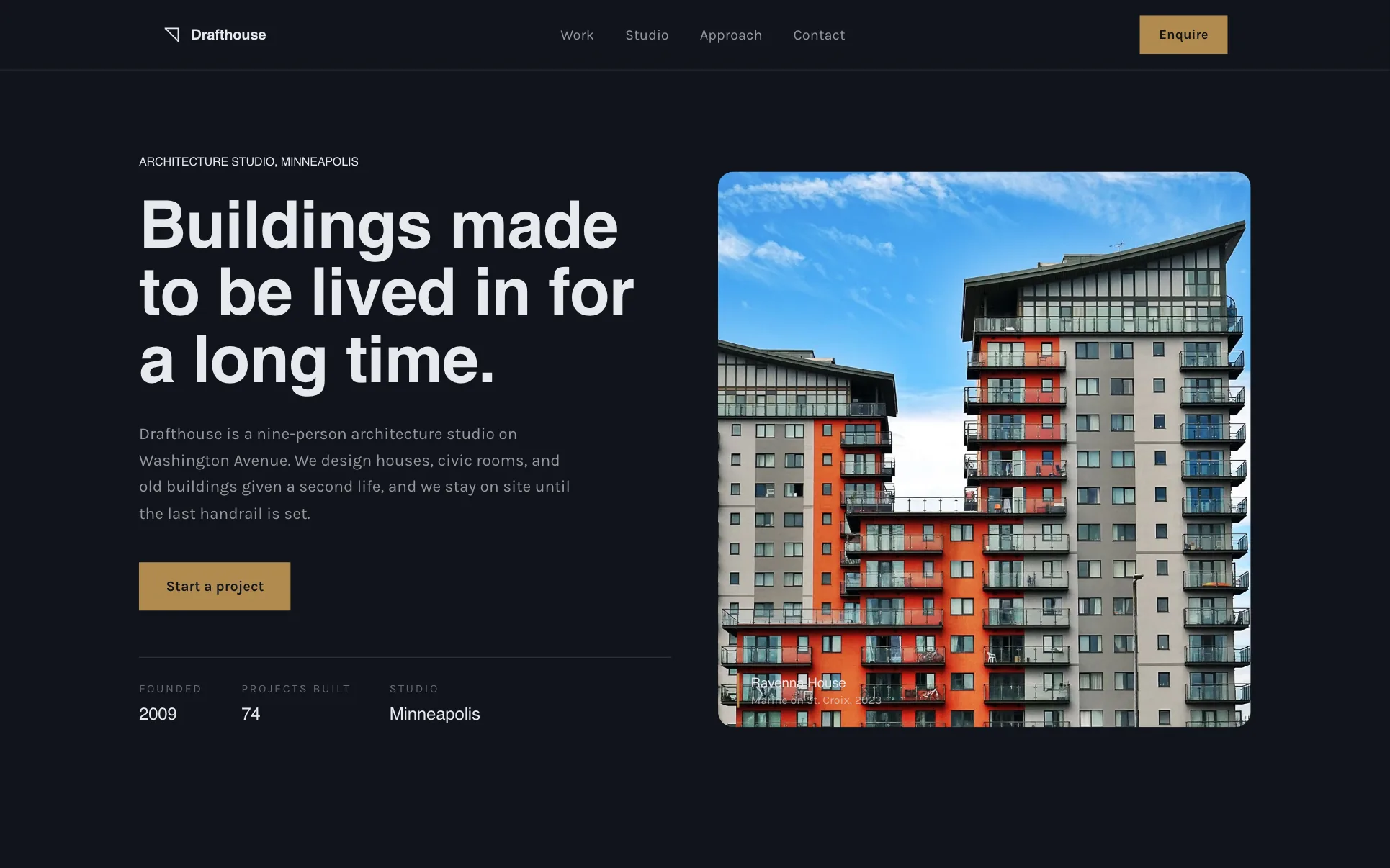
Why it works: Six projects straight after the headline; the work does the selling. Use it for: Architects, designers, photographers.
Personal and creator layouts
25. Writer with newsletter
Template: Plume (a We.Inc template design, not a customer site).
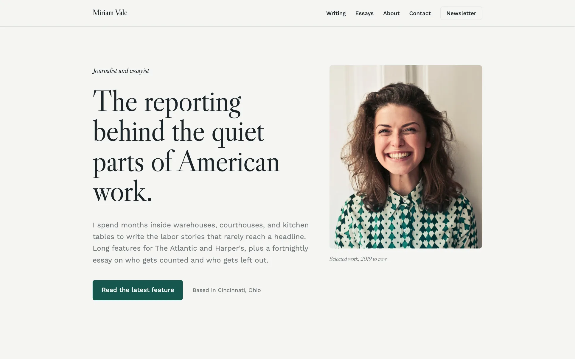
Why it works: Work, then a newsletter signup: the goal is readers who come back, not a single enquiry. Use it for: Writers, creators, speakers.
How to choose a layout
- Name the one action you want most visitors to take (call, book, buy, enquire, subscribe). That becomes the blue box.
- List the three questions a visitor asks before taking it (for example: do you cover my area, what does it cost, can I trust you). Each gets a section, in that order.
- Pick the pattern from the table above that matches.
- Cut sections you cannot fill with real content. An empty "Results" section or placeholder reviews do more harm than a shorter page.
- Check on a phone. Side-by-side boxes stack; make sure the main button still appears early (see mobile-first design).
Once a single page gets long, split it into several pages. Website structure shows how the sections above turn into a site map.
Common layout mistakes
- Putting the contact form only at the bottom of a long page, with no button in the header.
- Three columns of text on a phone-first audience; use cards that stack cleanly.
- Keeping template numbers, reviews or badges you cannot back up.
- A gallery before the visitor knows what you do.
Use one of these layouts
Every layout here is a template in the We.Inc template library. On the free plan you can use up to 3 template sites on a we.inc address (no AI credits, no custom domain). Starter at $20/month adds AI building, so you can ask for changes such as "move reviews above services", and custom domains; see pricing. Mock up your version first with the website mockup generator, then check the result with the website grader.
Frequently asked questions
What is a website layout?
The order and arrangement of sections on a page: what appears first, what sits side by side, and where the main call to action goes.
What is the best layout for a small business website?
For most service businesses: a hero with one clear button, services, proof such as reviews, and a contact or quote form, with the button repeated in the header.
How many sections should a homepage have?
As many as it takes to answer the visitor's main questions, and no more. The examples here range from four sections to eight.
Are these real business websites?
No. All 25 are We.Inc template designs, used to show layout patterns.
How do layouts change on mobile?
Side-by-side boxes stack vertically in the same order, so put the most important item on the left and keep the main button near the top.
What is the difference between layout and structure?
Layout is the arrangement of one page. Structure is how pages connect across the site: the hierarchy, URLs and internal links.
More in Guides
- Website Maintenance Packages: How to Scope, Price and Quote Them | How-to Guide
- Website Navigation Examples for Small Businesses (Annotated) | How-to Guide
- Website Platform Procurement Checklist: 42 Questions to Ask Vendors | How-to Guide
- Website Platform Total Cost of Ownership: A Five-Year Model for Organisations Running Many Sites | How-to Guide
- Public Sector Website Redesign Project Plan: Phases, Roles, Timeline and Risks | How-to Guide
- Website SLA Checklist: What a Service Level Agreement Should Promise, Measure and Exclude | How-to Guide
- Website Structure: How to Organise Pages, URLs and Links (5 Example Site Maps) | How-to Guide
- Website Title Examples for Homepages and Inner Pages | How-to Guide
Website builders for the businesses in this article
Related guides and tools
Start building
Product
Who It's For
- For Agencies
- For Freelancers
- For Hosting Providers
- For SaaS Platforms
- For Startups
- For Financial Services
- For Healthcare
Features
Resources
- Blog
- Help Center
- Free Business Tools
- Free UI Components
- Website Templates
- Template Collections
- Website Examples
- Guides
- Comparisons
- Alternatives
- Best Lists
- Reviews
- Pricing Guides
- Use Cases
- Glossary & Guides
- Integrations
- Developers
- Benchmark
- Windows App